
Author: Philip Hwang, Head of Strategy, APAC, SGK inc.
Don’t forget: packaging is your first and most powerful medium! And it’s being revolutionized. Driven by shifting priorities in society, culture, and environment, we’re seeing the following powerful design trends emerge:
Generation Z and Alpha: A Return to Emotion
Gen Z and Alpha are shaping the future of packaging while redefining beauty standards and norms. Values-driven, they crave authenticity above all else, demanding brands which align with their core principles.
And how in terms of design? Brands are communicating authenticity through texture and emotion, making a bold break from sterile minimalism. They’re also recognising the importance of commanding attention not only on-shelf, but also on Instagram. Vibrant, flattened colours, eclectic patterns, and eye-catching maximalist, custom typefaces have come together to create a new wave of design with scroll-stopping power.
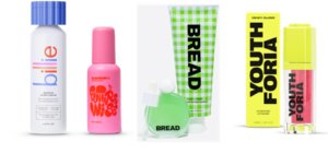
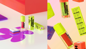
With its bright, bold colour clashes and 90s inspired packaging, beauty brand Youth Foria is poster child for packaging designed to pop on social media. Coupled with diverse representation and “in-the-moment” flash photography style, the brand’s take-no-prisoners approach to design mirrors other brands popular with Gen Z, such as Futurewise and Bread.
Eliminating Boundaries: Less is More
In today’s beauty landscape, inclusivity is taking center stage as many brands break free from gender and age constraints, redefining skincare with a powerful “beauty for all” approach. But how can design connect with the widest possible audience, yet make each individual feel like it’s specifically for them?
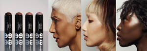
Canadian beauty brand 19/99, is leading the charge in typography-led, monochromatic, genderless packaging. Clean, minimalist design combined with unfussy, sans serif typefaces and use of generous white space gives it the stretch to appeal to those—like its philosophy and name—range from 19 to 99 years old.
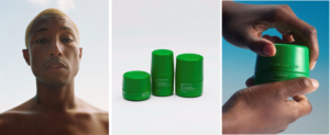
But lest you think that crossing age and gender boundaries demand subtlety, the color green has emerged as a versatile yet powerful unisex color that lies perfectly between traditional masculine and feminine colors. Use in bold, mono-chromatic splashes as Humanrace does, to punch up your boundary-blurring brand.
Local Maximalism: Culturally Rooted
At the same time that formulations are increasingly tailored to local skin tones, design is amping up cultural pride—making the resulting brand, truly “made for me.”
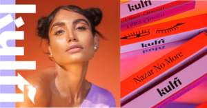
Indian brand Kulfi speaks directly to this rising trend, with heritage-inspired designs, calligraphy-touched typeface, and photography styling inspired by Bollywood. The result? A brand that complements Indian skin tones, but also speaks distinctly to their cultural heritage.
Max out on Sustainability: A Format Reimagined
Sustainability is fast becoming a “right to play” for the beauty industry, with brands opting for alternate substrates and materials and taking a holistic approach to reducing their footprint. This carries through to design, where earth-inspired colours and carbon-reducing materials such as wood, bio-PET, and recycled plastic are gaining prominence.
“Salvage chic” is becoming increasingly popular, with brands like Baum using reclained wood, and Reise using the same rice bran in formulation, as bio-plastic.
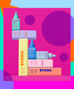
Brands are also embracing a circular approach. For example, BYOMA utilises fully recyclable, refillable packaging in an easily stackable shape that minimizes its carbon footprint during shipping as well, taking a full-cycle view on sustainability.
But what does this mean for your brand? To apply these trends, it’s important to:
- Keep your brand truths in mind to “break the rules” effectively. Gender-less, race-inclusive, and sustainable can sometimes lie at opposite tension points of design.
- Think of sustainability as additive value, instead of deductive promise. Use it as an opportunity to stand out while doing good.
- Consider your design tactics. The pendulum is swinging back to texture, emotion, and boldness – don’t forget that being distinctive is any brand’s number one goal.
By harnessing design tactics, beauty brands can create packaging that not only reflects their ethos but truly resonates with the values of their consumers.
Do you want to read more? Find out how Season 365 Haircare brand’s packaging re-imagines modern simplicity in Japan.
 Phil Hwang, Head of Strategy, APAC, SGK
Philip has over 14 years of experience in branding and design, covering both consumer and corporate sectors. As Head of Strategy, he leads brand platform creation, new product innovations, and brand architecture and portfolio projects for APAC.
Philip brings a multi-cultural sensitivity to projects spanning global and local footprints. Over a career spanning Europe, US, and Asia, he has helped create Shanghai Vive, China’s first luxury skincare brand; brought Mary Kay into the haircare category; created brand platforms and identity for Moet-Hennessy Diageo; and lead product innovation for AB-InBev, Taiwan Tobacco & Liquors, and General Mills.
Enjoyed this article? Get more by subscribing to our newsletter!
Feeling inspired to see ingredients and trends in action?
Then why not visit one of the in-cosmetics events around the world?